Truckstop.com Rebranding
The objective was to execute a strategic evolution of the Truckstop brand identity, aligning it with the high-clarity, sophisticated aesthetic of modern SaaS standards. This transition was critical to ensuring the new product ecosystem felt natively integrated into the Truckstop portfolio while simultaneously reinforcing the company’s credentials as a provider of enterprise-grade, highly usable software.
Strategic Objectives
- Modernize the SaaS Identity: Shift the brand away from “grunge” textures and a dirtier feel toward a cleaner, light-filled aesthetic that signals technological maturity.
- Establish Enterprise Credibility: Position the brand to resonate with large-scale enterprise customers by prioritizing professional design standards.
- Maintain Industrial Authenticity: Preserve the brand’s heritage and trust within the logistics community through strategic use of industry-specific visual cues.
Collaboration
We oversaw the creative direction of an external agency, managing the conceptual development phase to ensure alignment with internal business goals. This collaborative process resulted in three distinct brand proposals presented to internal stakeholders. From these, we distilled the most effective elements into a singular, cohesive brand system.
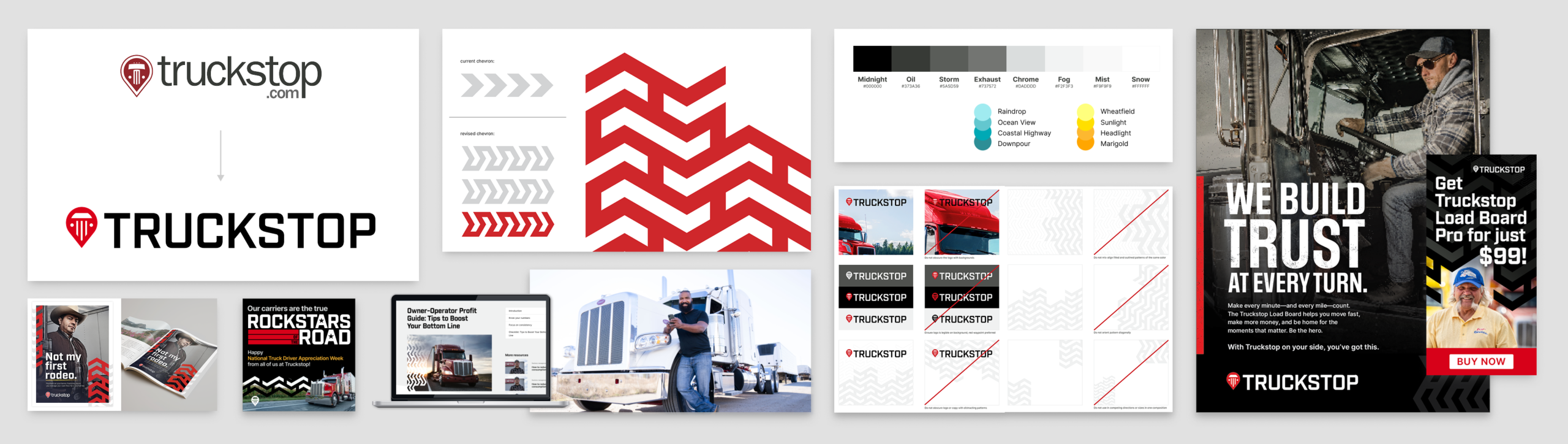
- Core Visual Development: I personally led the redesign of the simplified primary logo and color palette to enhance brand recognition within a crowded digital and physical marketplace. This move was a strategic shift toward high-visibility “iconic” design, ensuring the brand remains instantly identifiable across all touchpoints.
- Asset Integration: I curated and synthesized high-value agency assets—such as a refined, modern tread pattern—seamlessly incorporating them into the broader identity to bridge the gap between digital innovation and industrial heritage.
- Creative Direction: I facilitated the stakeholder feedback loop, translating complex internal requirements into actionable design directives and merging the most successful elements from three distinct proposals into a unified vision.
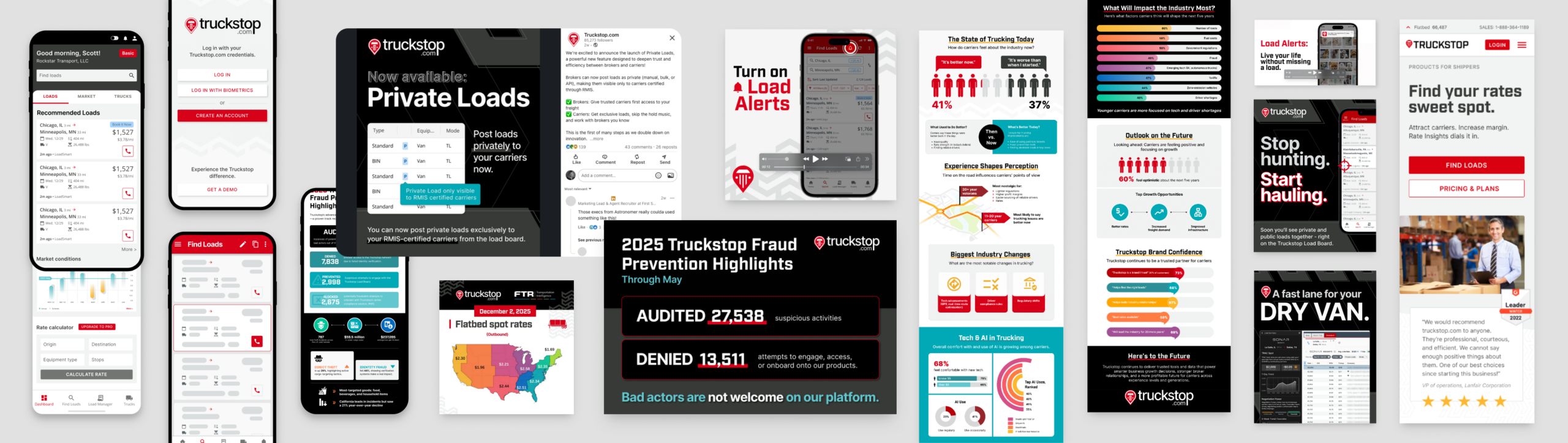
- Art Direction: I directed comprehensive photoshoots to curate a custom library of high-impact imagery, further defining the brand’s visual identity. By overseeing the process, I ensured the new photography authentically captured the intersection of modern logistics and the human element of the transportation sector, reinforcing the brand’s unique market position.
The Balanced Visual Language
The final brand identity strikes a calculated balance between technological innovation and industry tradition:
- The SaaS Framework: The removal of “grunge” textures in favor of a clean, high-clarity interface provides a premium user experience that emphasizes usability.
- Industry Credibility: To ensure the brand remained grounded in the transportation sector, we utilize darker colors and incorporated custom photography of real people and industry professionals.
- Tactile Texture: An updated, modernized tread pattern was implemented as a core graphic element, providing a bridge between the digital experience and the physical reality of the road.
- Omnichannel Versatility: While digital platforms lean toward a light and clean aesthetic, Print and Events were utilized as high-impact channels to express the brand’s more authentic, rugged trucking roots through bold visuals and environmental graphics.
Heritage Modernization
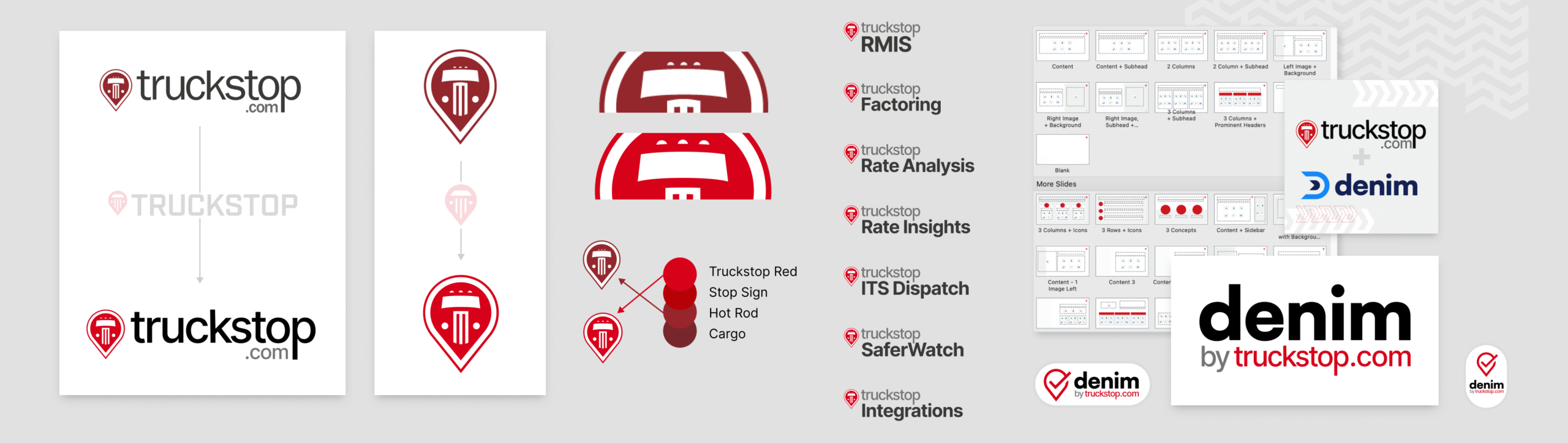
Following the return of Truckstop’s founder as CEO in mid-2025, the brand underwent a strategic pivot to re-incorporate heritage elements, including a logo mark more reflective of the company’s original identity. I managed the integration of this legacy-inspired mark into our framework, ensuring the brand’s newfound technical maturity remained intact.
Key Refinements & Technical Adjustments:
- Scalability & Readability: I secured stakeholder approval for critical micro-adjustments to the logo mark, specifically optimizing the scale and spacing of internal elements. These modifications were essential for maintaining visual integrity across challenging applications, such as mobile UI and physical embroidery.
- Typography Synthesis: To ensure a cohesive brand narrative, the wordmark was updated to utilize the new, high-clarity SaaS typography, bridging the gap between the brand’s heritage and its future-facing digital presence.
- Strategic Color Management: I maintained the use of the revitalized, high-impact red from the previous update, ensuring the brand retained its modern, eye-catching visibility in a competitive market.